Step 1
Content and journey review
Reviewed how users were discovering the brand and where the experience lacked clarity. Identified friction between interest and taking action.
Project
Align Body & Mind
Role
Lead Developer & Designer
Date
2026
Project
Align Body & Mind
Role
Lead Developer & Designer
Date
2026
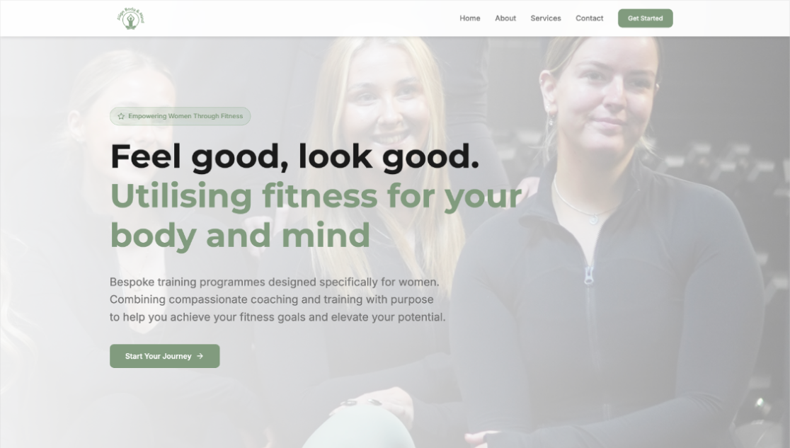
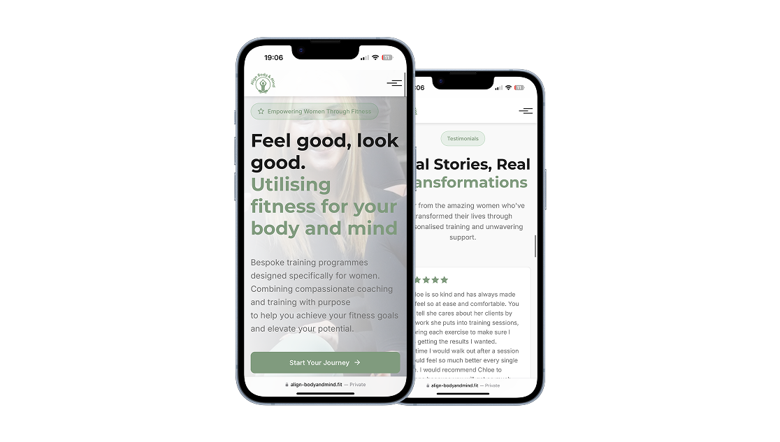
The existing digital presence for Align Body and Mind lacked clarity, structure, and a defined user journey. Key information around services, audience, and value proposition was unclear, creating friction for potential clients trying to understand what was offered or how to book. Like many wellness-focused businesses, the brand relied heavily on social media, resulting in a fragmented experience with no centralised, conversion-focused platform.
The process for Align Body & Mind combined brand positioning with conversion-focused UX thinking. Rather than treating the site as a visual refresh alone, I used the process to clarify the offer, reduce uncertainty and guide visitors toward enquiry with more confidence.
I started by reviewing the existing touchpoints and identifying where potential clients were dropping into the experience without enough context. From there, I reworked the structure around clearer service communication, stronger calls to action and a calmer content flow that better matched the brand. The design phase focused on building trust quickly while keeping the journey simple and emotionally aligned with the business.
Step 1
Reviewed how users were discovering the brand and where the experience lacked clarity. Identified friction between interest and taking action.
Step 2
Refined the messaging to clearly communicate services, audience and value. Ensured users could quickly understand what was being offered.
Step 3
Restructured the site to present services, outcomes and booking paths more clearly. Improved flow to guide users toward enquiry.
Step 4
Placed calls to action more intentionally to reduce friction. Focused on supporting user intent and increasing enquiry confidence.
Step 5
Developed layouts that balanced clarity with a calm, engaging flow. Prioritised readability and clear progression through the site.
Step 6
Applied a clean and brand-aligned UI to reflect a professional and welcoming identity. Balanced aesthetic with functional usability.
Step 7
Polished the final experience to ensure consistency across pages. Delivered a smooth, intuitive journey from landing to booking.
I reframed the project from a visual redesign to a conversion problem, focusing on reducing friction between interest and action. I restructured the information architecture to clearly communicate services, target audience, and outcomes, while introducing a more guided user flow. Clear calls-to-action and a simplified booking journey were prioritised to support user intent. The design balanced a calm, wellness-driven aesthetic with functional clarity, ensuring the interface both reflected the brand and improved usability.
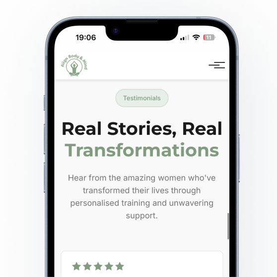
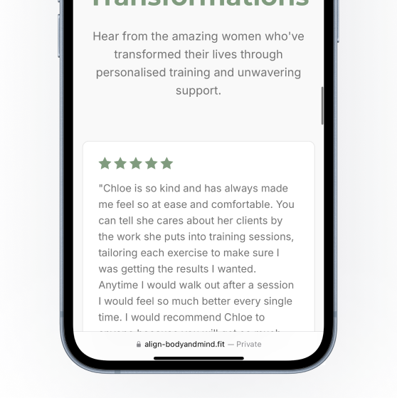
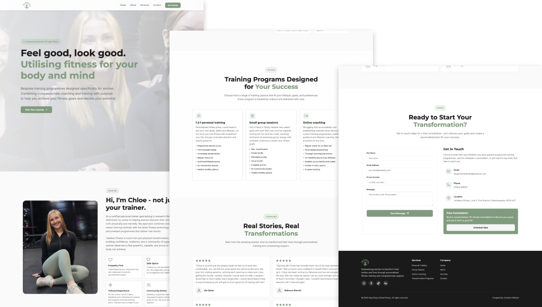
The redesigned experience provided a clearer, more structured pathway for users, improving understanding of services and making it easier to take action. By consolidating information into a single, cohesive platform, the site reduced reliance on external channels and created a more professional and trustworthy digital presence. The project demonstrated how aligning brand, content, and user flow can significantly improve engagement and conversion for small service-based businesses.
"The new website reflects exactly how I want my brand to feel — strong, professional and welcoming. The integrated onboarding form has streamlined my client intake process and reduced manual admin, allowing me to focus more on coaching. Since launch, I’ve seen a noticeable increase in enquiries."
Chloe, align body & mind