Step 1
Experience audit
Reviewed the existing site to identify issues with layout, responsiveness and readability. Highlighted areas impacting usability and first impressions.
Project
EngravingNI
Role
Lead Developer & Designer
Date
2023
Project
EngravingNI
Role
Lead Developer & Designer
Date
2023
Engraving NI was a long-established local business with limited digital presence and an outdated website experience. The existing platform lacked responsiveness, clear navigation, and modern usability standards, making it difficult for users to explore services or understand offerings online. The challenge was to modernise the experience without losing the trust and familiarity built over years as a local business.
For Engraving NI, the process was about careful modernisation. I wanted to improve usability and visual quality while respecting the familiarity and trust the business had built over time with a local audience.
I began by reviewing the existing site experience across devices and identifying where layout, hierarchy and responsiveness were falling short. That informed a clearer content structure and a more contemporary visual system that still felt grounded and approachable. As the project developed, I focused on streamlining navigation and reducing friction so users could understand services quickly without the site losing its established character.
Step 1
Reviewed the existing site to identify issues with layout, responsiveness and readability. Highlighted areas impacting usability and first impressions.
Step 2
Reduced unnecessary content and clarified messaging to help users quickly understand services. Focused on improving clarity and reducing friction.
Step 3
Defined a visual direction that felt more contemporary while maintaining the business’s established identity. Balanced trust with a more updated look.
Step 4
Restructured pages to improve hierarchy and navigation. Ensured users could easily find key services and information.
Step 5
Designed and developed layouts that worked consistently across desktop, tablet and mobile. Improved accessibility and overall usability.
Step 6
Applied a clean and consistent UI to enhance readability and interaction. Introduced subtle elements to improve engagement without overcomplicating the experience.
Step 7
Tested across devices and refined the experience to ensure smooth performance. Focused on delivering a reliable and intuitive final product.
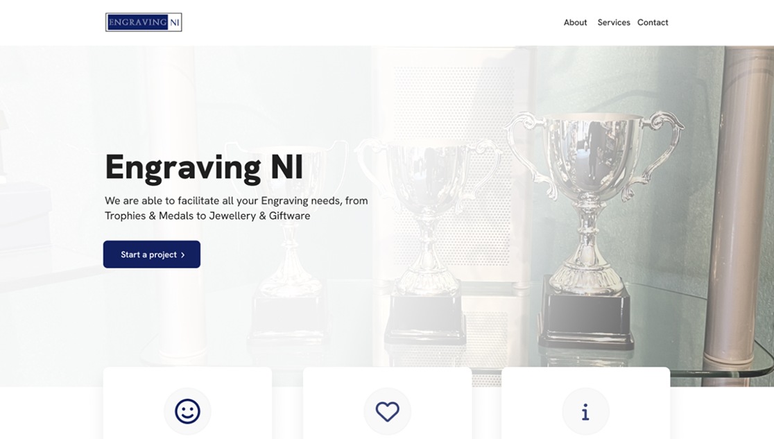
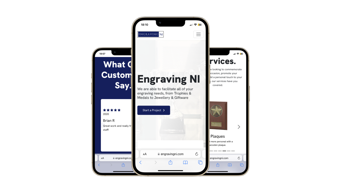
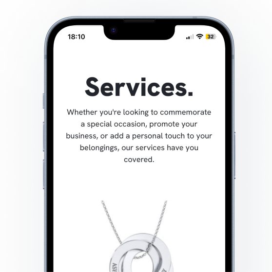
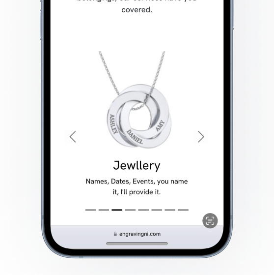
I designed and developed a responsive, brochure-style website focused on clarity, accessibility, and ease of use. The structure prioritised simple navigation, reduced unnecessary content, and introduced a clean visual system to improve readability. I also incorporated subtle interactive elements, such as animated testimonials and product exploration features, to enhance engagement while maintaining a straightforward user journey.
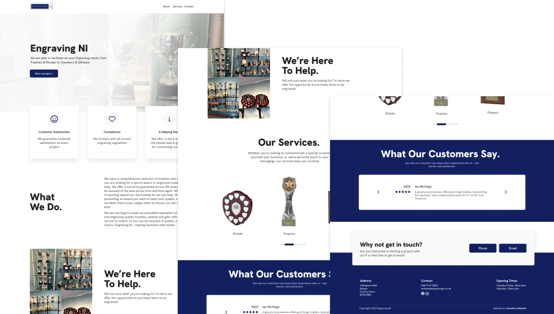
The final result delivered a modern, user-friendly platform that refreshed the business’s digital presence while preserving its established identity. The improved structure and responsiveness made it easier for users to navigate and engage with services across devices, helping expand the business’s online reach and appeal to a broader, more contemporary audience.
"Jonathon completely modernised our website while keeping the character of our business intact. The new site is clear, easy to use, and better reflects who we are. We’ve had great feedback from customers already."
Andrew, Engraving NI